There are times when almost any color will catch them. The bites on; they’re eating with total abandon. They could care less what something looks like just as long as it’s moving. We come off the water thinking we have this fishing thing figured out.
But that’s not the way it is most days. Easy doesn’t usually define fishing.
When the bite gets tough, I start to get real selective about my color choices, and I don’t much care what’s causing the tough bite. It could be a cold front. It could be clear water with bright, sunny bluebird skies. Or it could be the most common cause of them all — heavy fishing pressure.
The first thing to do when you’re faced with a tough bite is to try to match the hatch. No matter how bad you want to start casting — after all, you’ve been waiting all week for this day to come — you should take a few minutes to watch the minnows and crawfish. That’s not all that hard to do. There are almost always some of them around the dock.
Check out what the baitfish look like as they swim along. Does their color change when they move in and out of the sunlight? If there’s more than one species around, take note of their color differences. Do the same thing with any crawfish you can find.
And don’t forget about the sheen. Everything in the water has a sheen to it. What does it look like? Is it bright, or dull? Does it have a distinctive color cast to it?
Once you know what the local forage looks like, you can start to make realistic color choices. Always try to come as close as possible to the real thing. Picking a lure to fish with, or deciding which one to buy, isn’t about what looks good to you. Lures aren’t supposed to catch fishermen. They’re supposed to catch fish.
I’ve talked before about putting my lures out in the sun, on a windowsill, for weeks at a time to let the paint fade. I also added fingernail polish with real fine glitter in it to give the bait sheen. (Don’t worry. You’ll get over the embarrassment after a couple of trips to the beauty parlor. I did.)
My reason for doing that was to make them look natural. I wanted to take some of the brightness off of them so that they didn’t look like freshly painted plastic or wood. It worked, and not just for me.
A few years ago, working with Rapala, I helped develop a line of colors called Custom Ink Colors. They look like the faded ones on my windowsill. At least one B.A.S.S. professional tournament has been won using them in each of the last three years. I’m not saying they caught all the fish but they made a substantial contribution to the winning weight.
When you’re faced with a tough bite, throw the most natural looking colors you can get your hands on. They may not be the prettiest ones in your tacklebox but they’ll catch fish, and that’s why you’re out there.
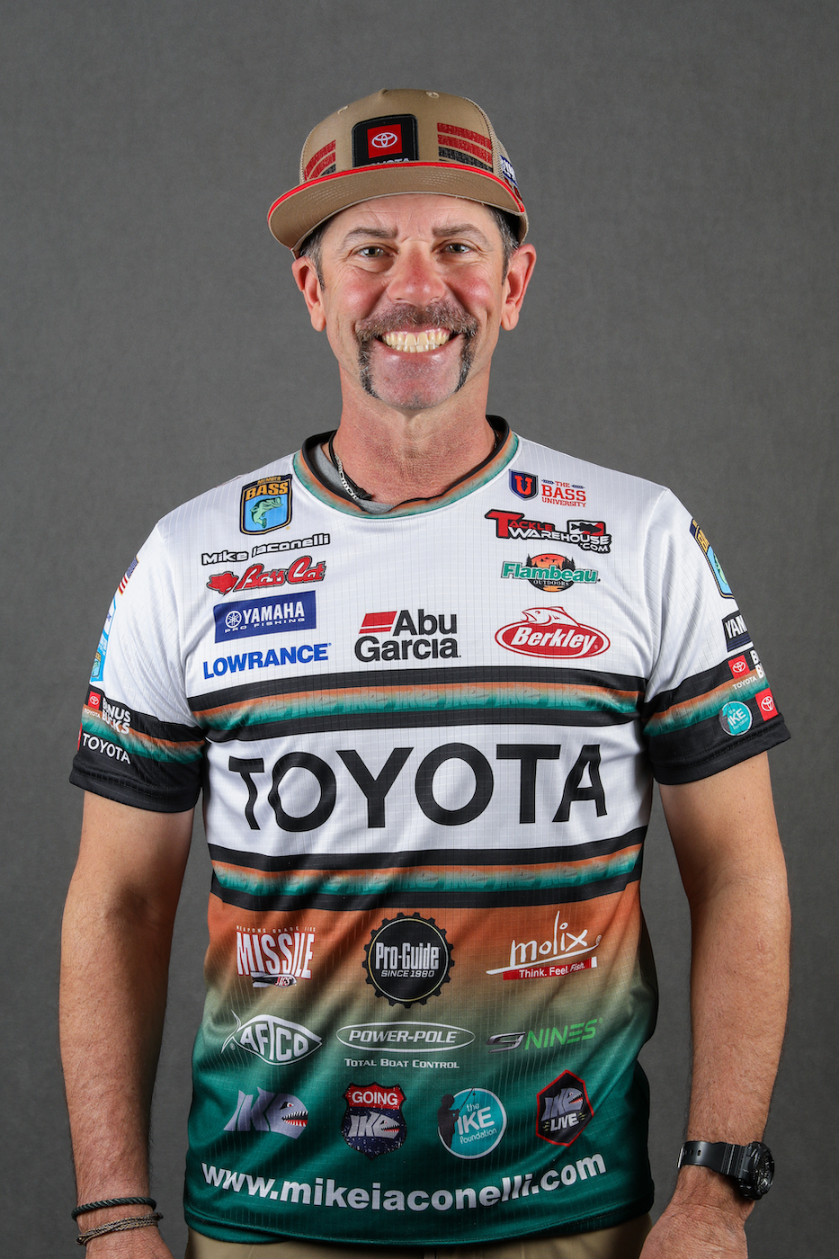
Mike Iaconelli’s column appears weekly on Bassmaster.com. You can also find him on Facebook and Twitter or visit his website, MikeIaconelli.com.


